Nitrogen
Creating a gateway into the Solana ecosystem
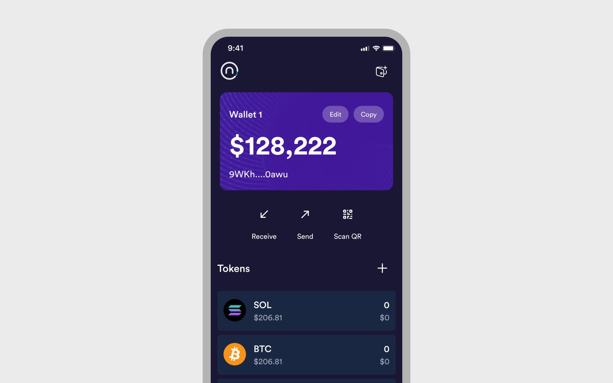
Nitrogen is wallet that allows users to manage their Solana assets on mobile and desktop.
Challenge
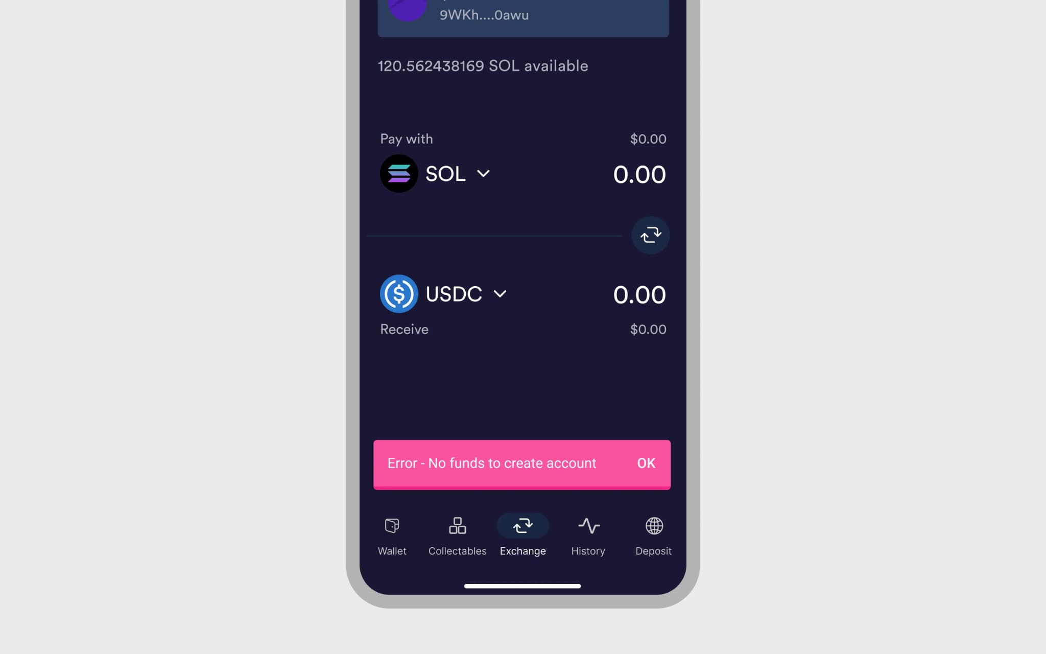
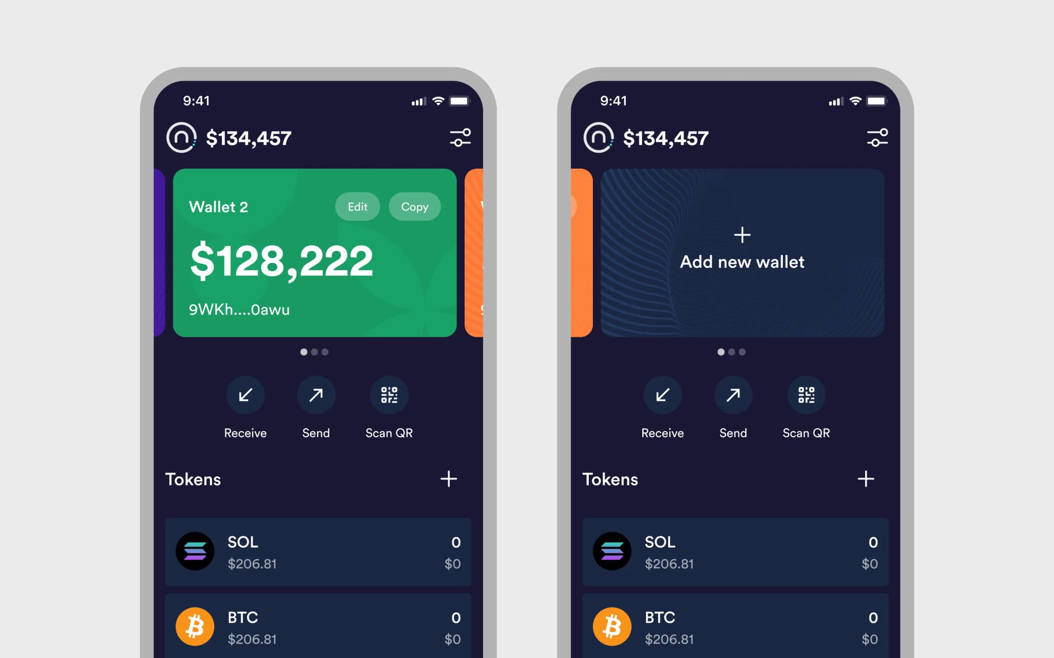
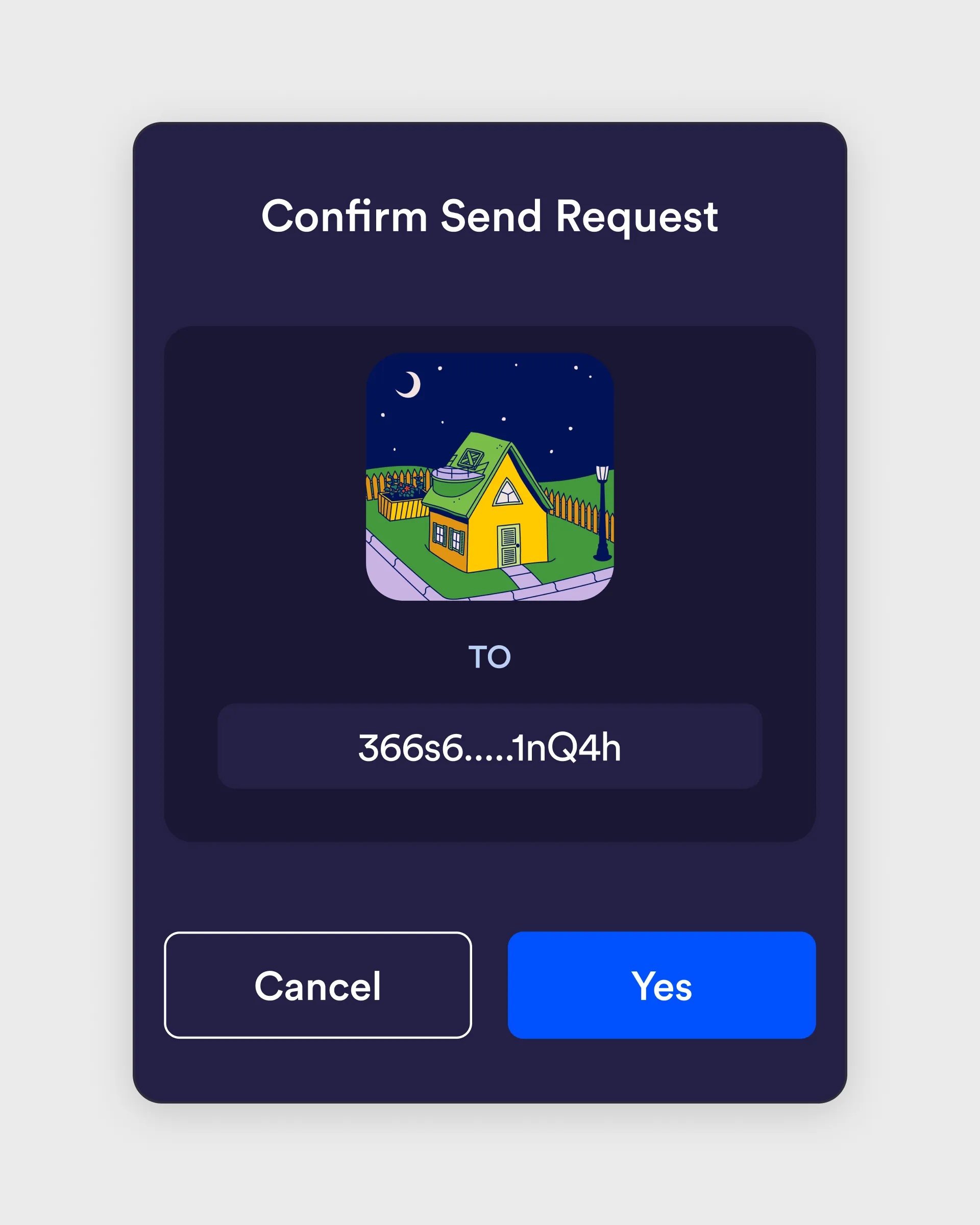
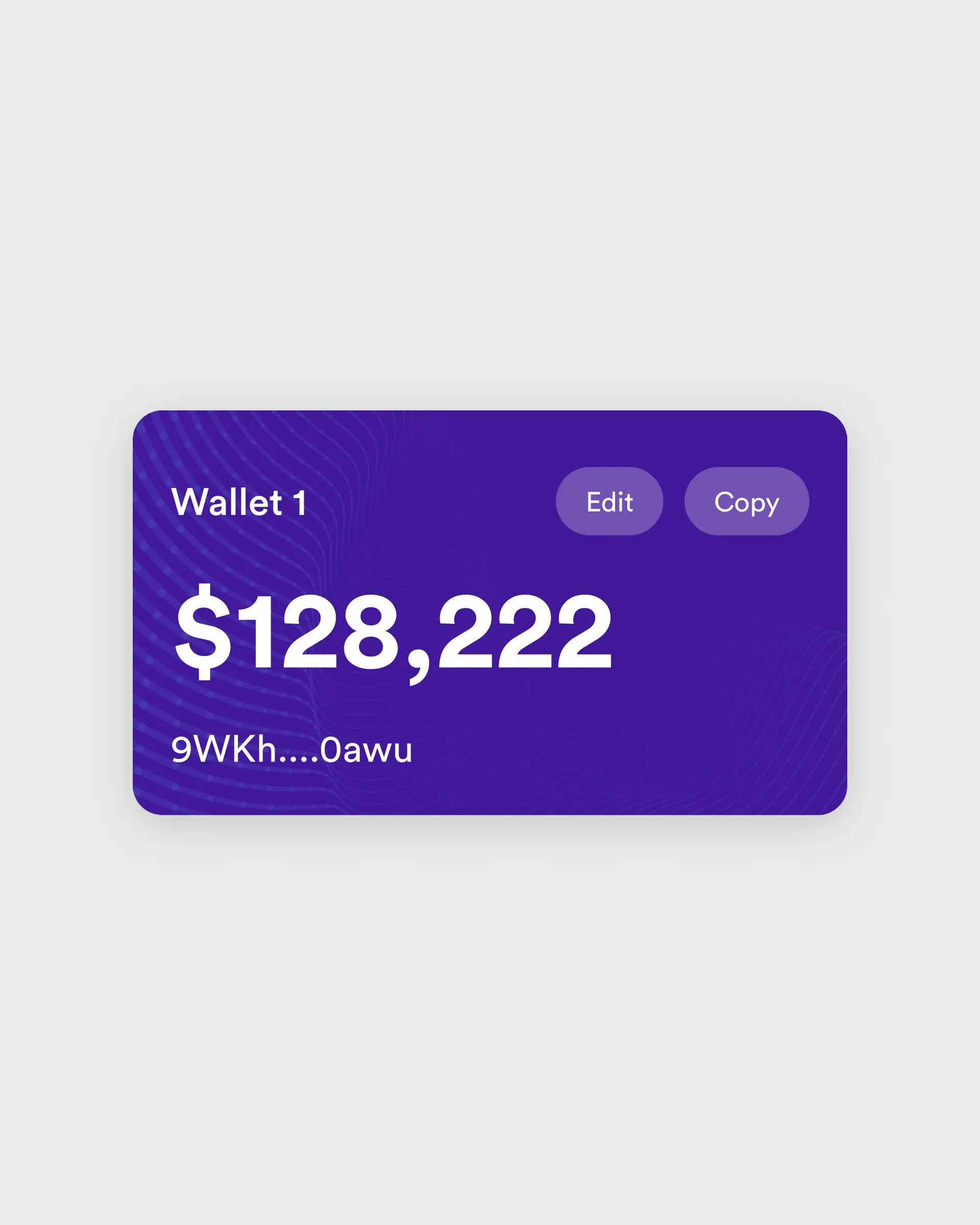
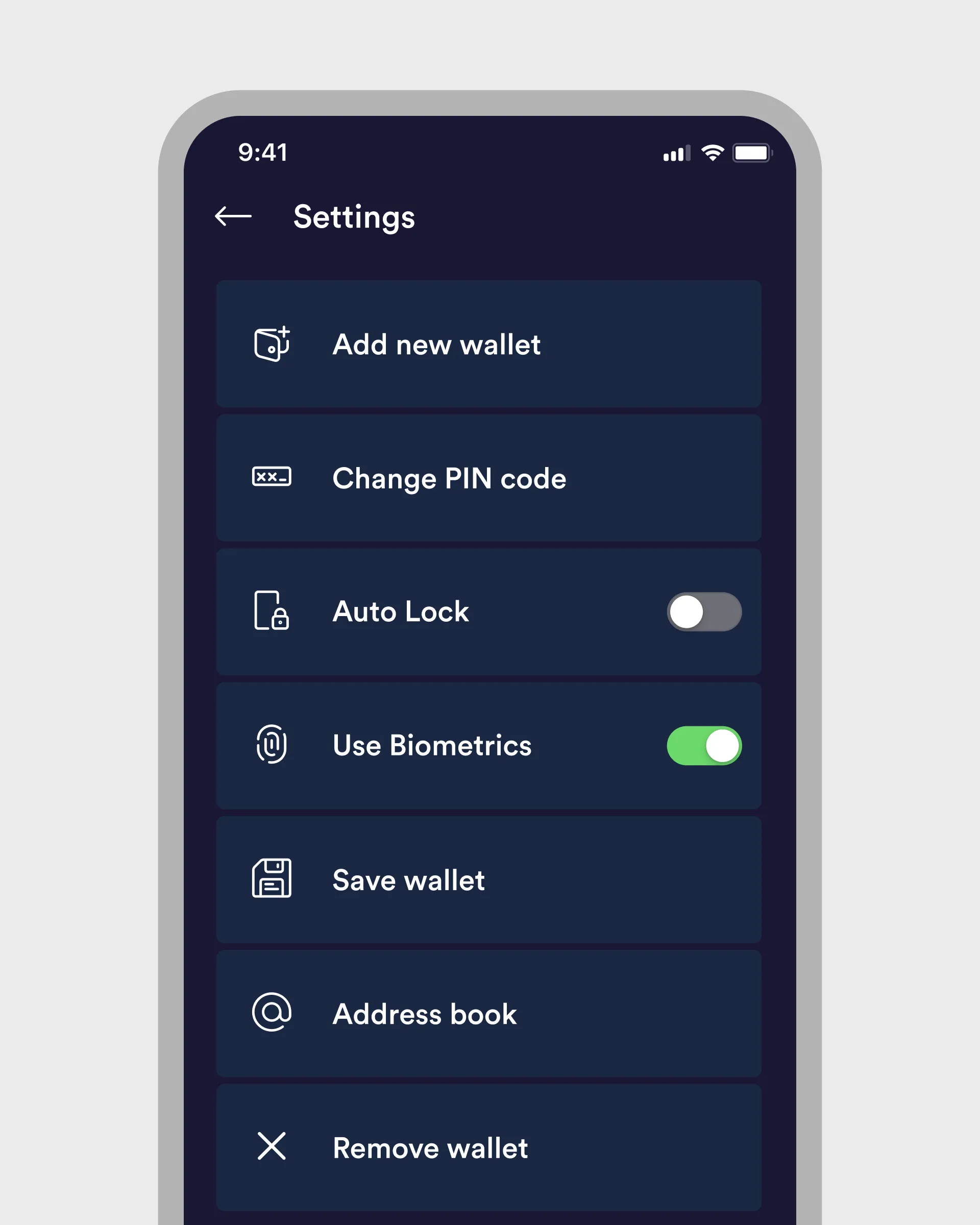
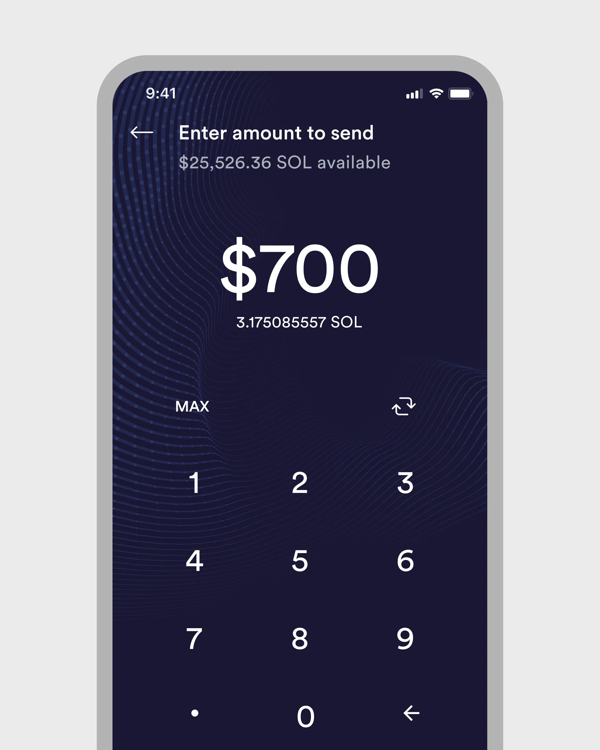
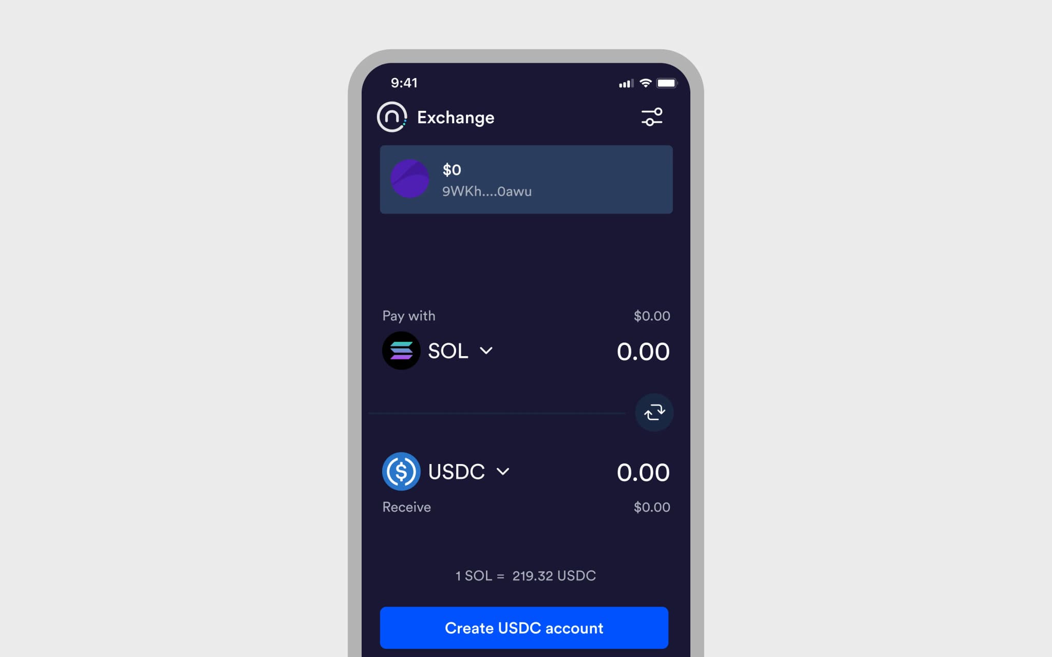
The product team at Nitrogen gave us the challenge of redesigning their existing mobile app. The goal was to improve the user experience, redesign the user interface, and design some of the new features being implemented. Nitrogen is positioned as a gateway into the Solana ecosystem, and therefore caters for newcomers to cryptocurrency, DeFi and GameFi. We designed the app from the ground up, including the onboarding.
Impact
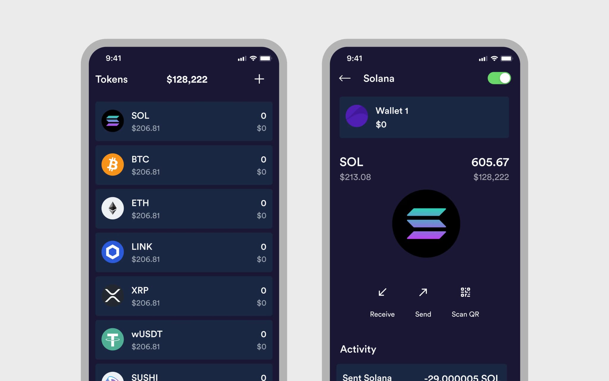
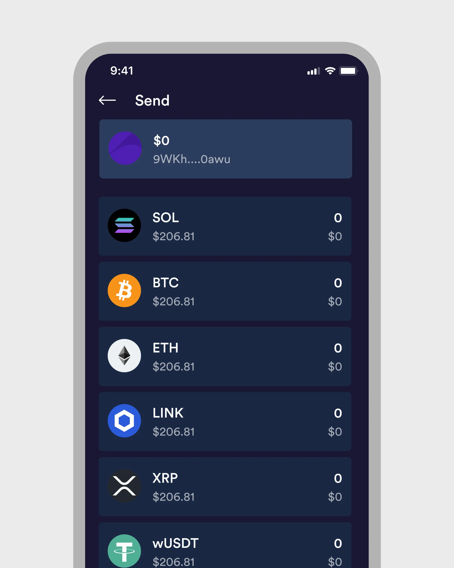
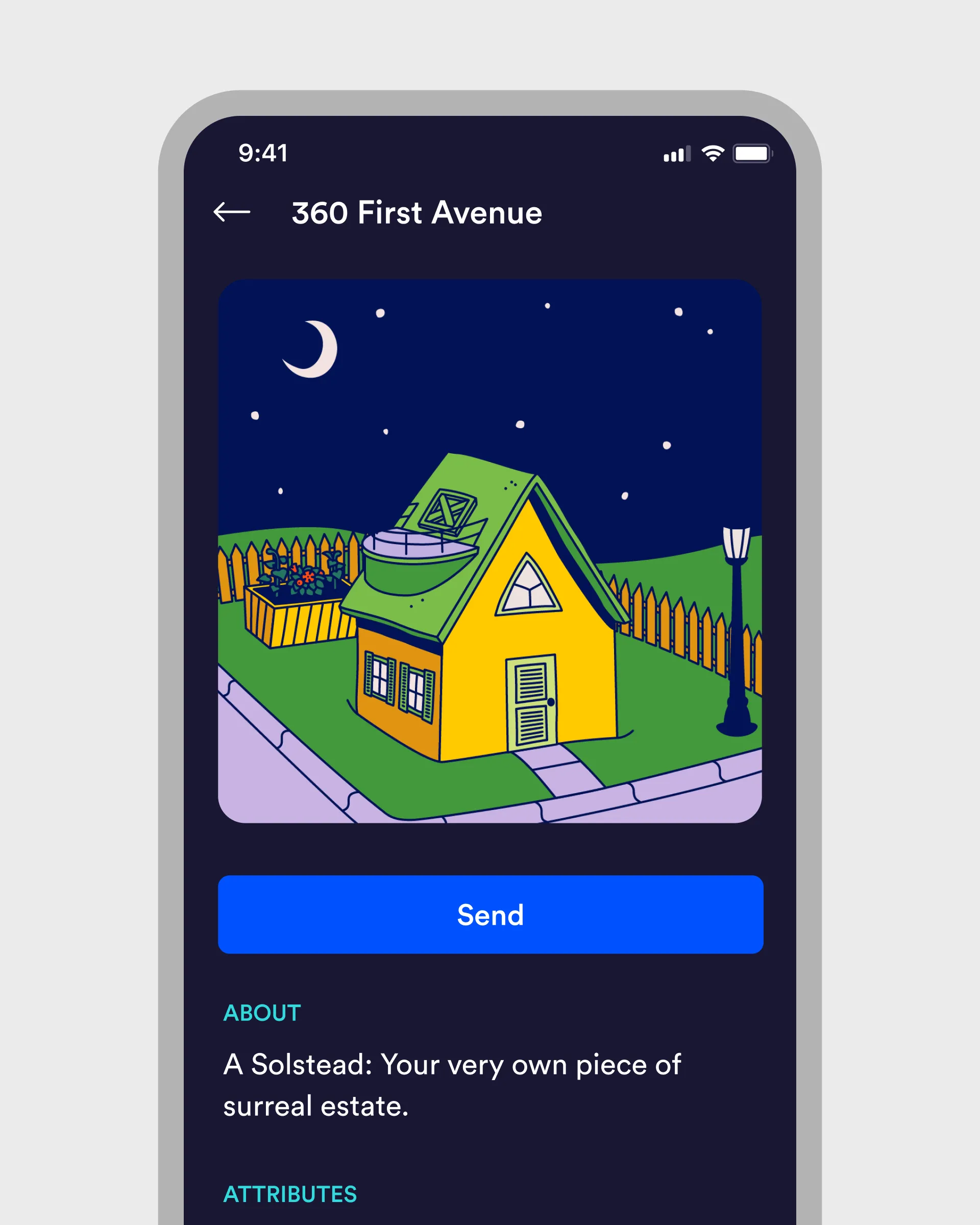
Redesigning the Nitrogen wallet mobile app in a 5-day UX Sprint was an ambitious target. However, we delivered over 80 screens to the Nitrogen product team, presenting the app on iPhone SE, iPhone 13 and Android.
How we helped
- •User research
- •Market Research
- •Wireframing - Low-fidelity, high-fidelity
- •UX design
- •Design system
- •Prototyping
- •User testing
App UI Design
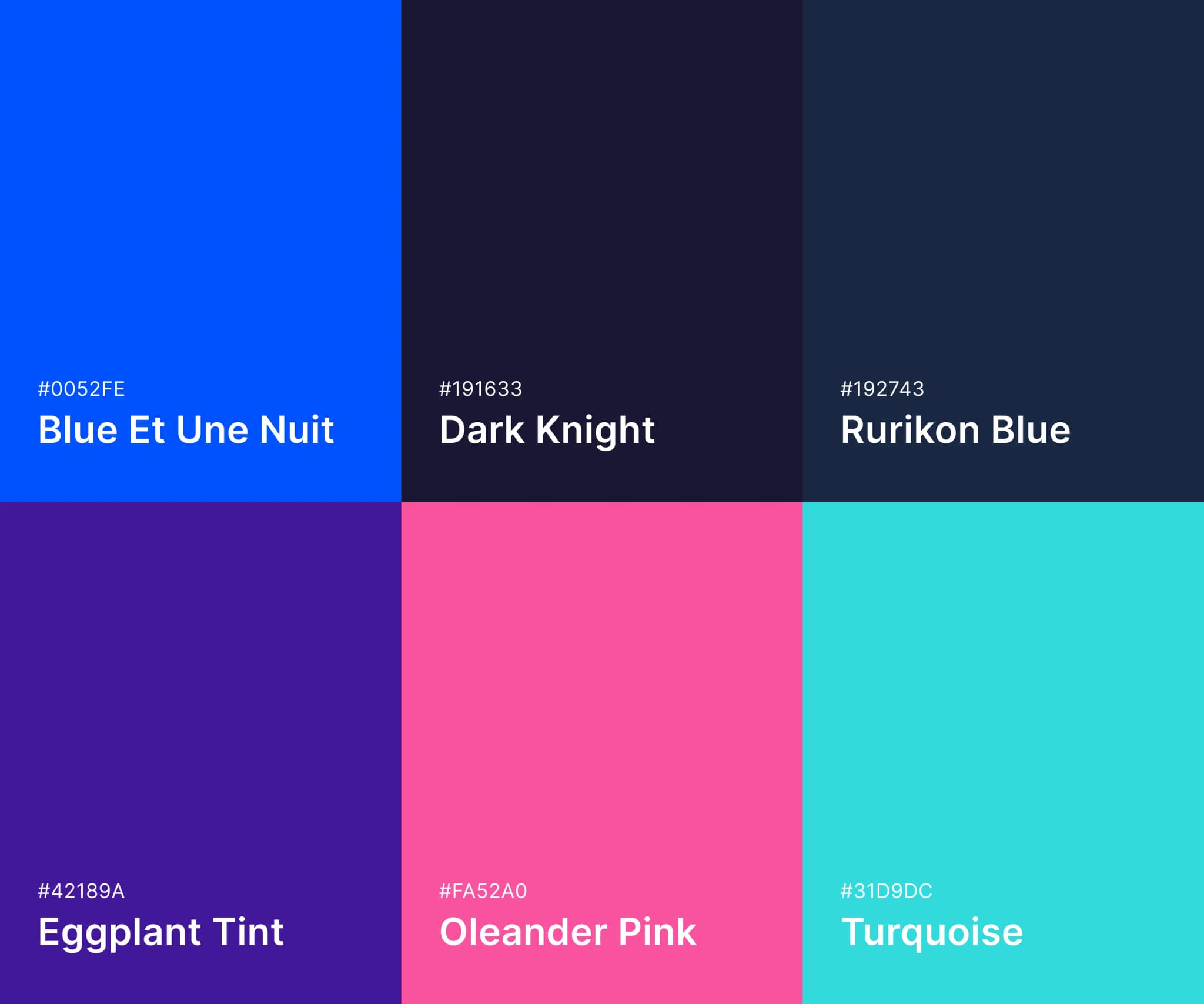
Branding
Approach
Pre-flight
We had a four hour meeting the week before the sprint to meet the team, discuss the project brief, confirm the deliverables and obtain any necessary assets before the first day of the sprint.
Daily calls
Every morning we had a 15 minute stand up with the Nitrogen team
Show & Tell
At the end of each day we sent an email with a link to a prototype plus a video screencast of us presenting our work to the Nitrogen team
Prototyping
Prototypes not presentations - we prefer to show prototypes instead of screens. This allowed the Nitrogen team to walk through user journeys instead of a set of static screens.
Handover
We performed two rounds of user testing. First we ran user testing on the existing Nitrogen app, and on day 3 we ran a second session on the prototype that we had created
Project
Team
- •2x Senior UX Designers
- •1x Researcher
Date
Jan 2022
Outcomes & Deliverables
80+ screens
Registration, onboarding, global information architecture
Production-ready
Production-ready screens, assets and iconography
Prototype
Comprehensive prototype split into user journeys
User testing
Video and feedback presented in a report
Design System
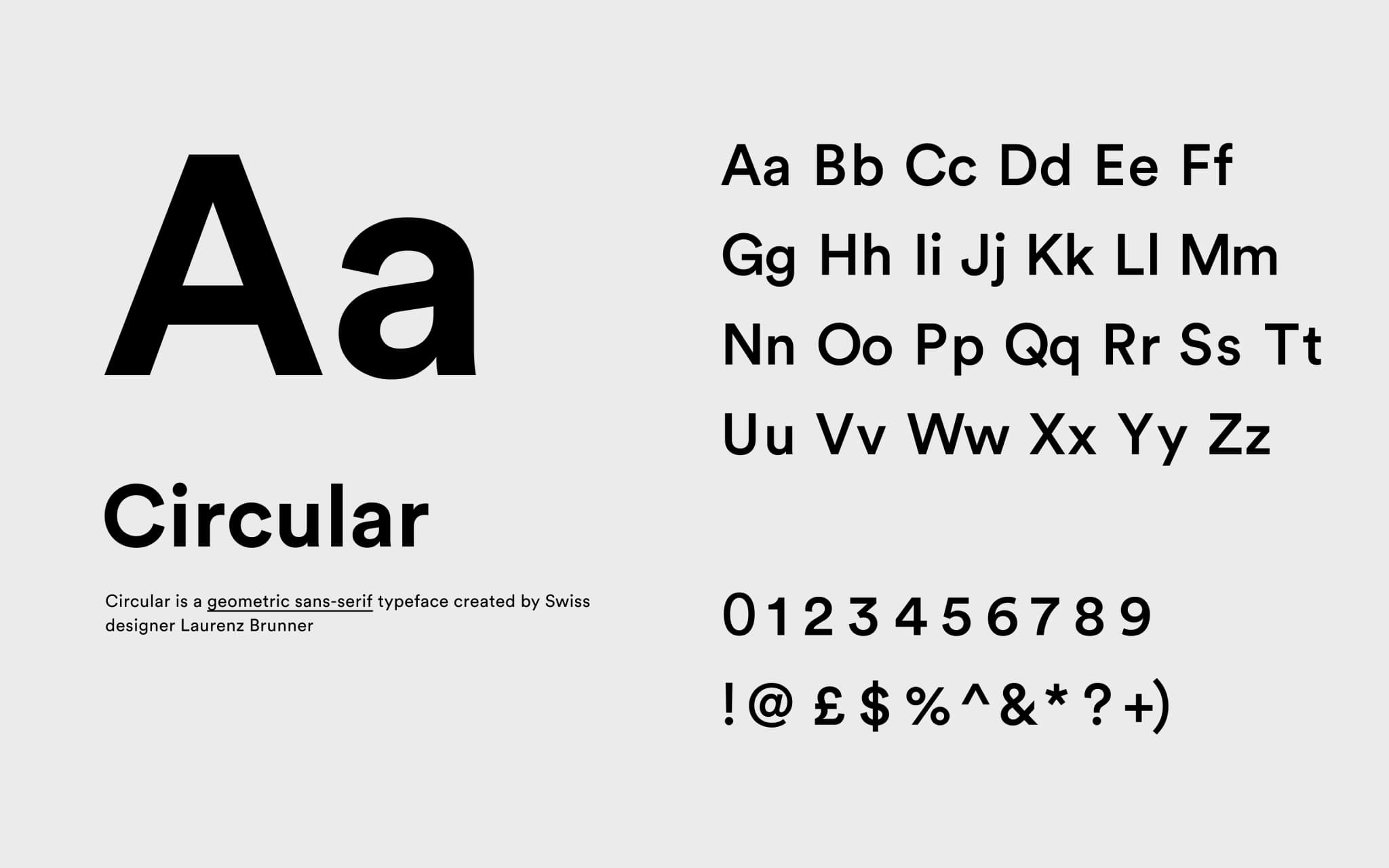
Colour, iconography, typography, grids, components
Research
User and market research deliverables
Video walkthrough
Sharable video of us presenting the final deliverables
5 day delivery
Start to finish in just five days
Next case study
Oxygen