Sherbet
Insurance reimagined
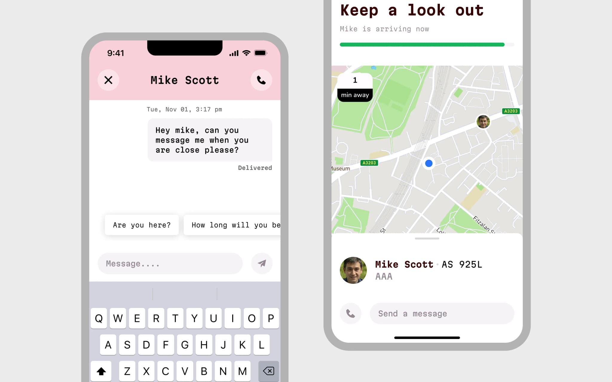
Sherbet is insurance built for the 21st century, primarily aimed at young women in the US.
Challenge
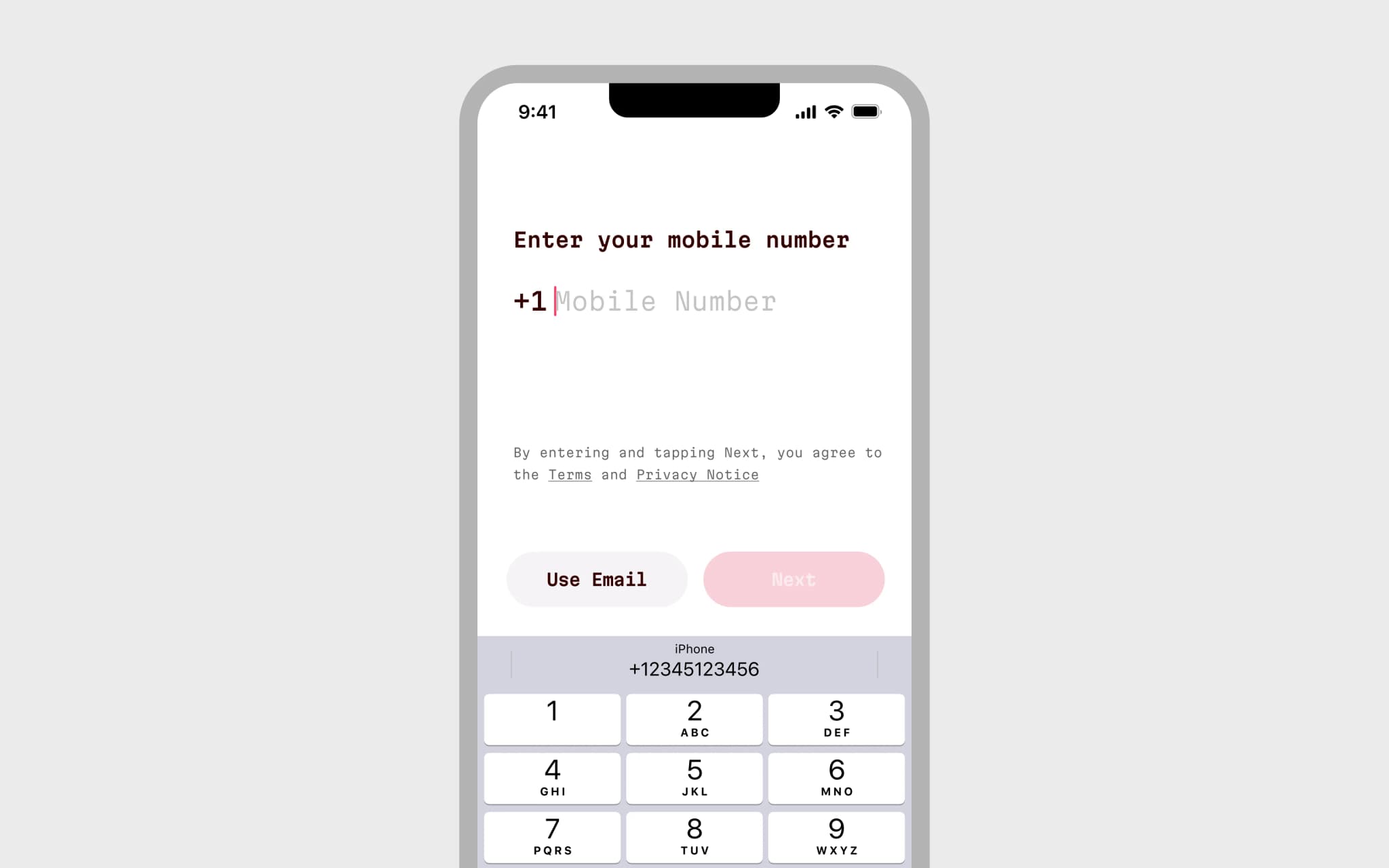
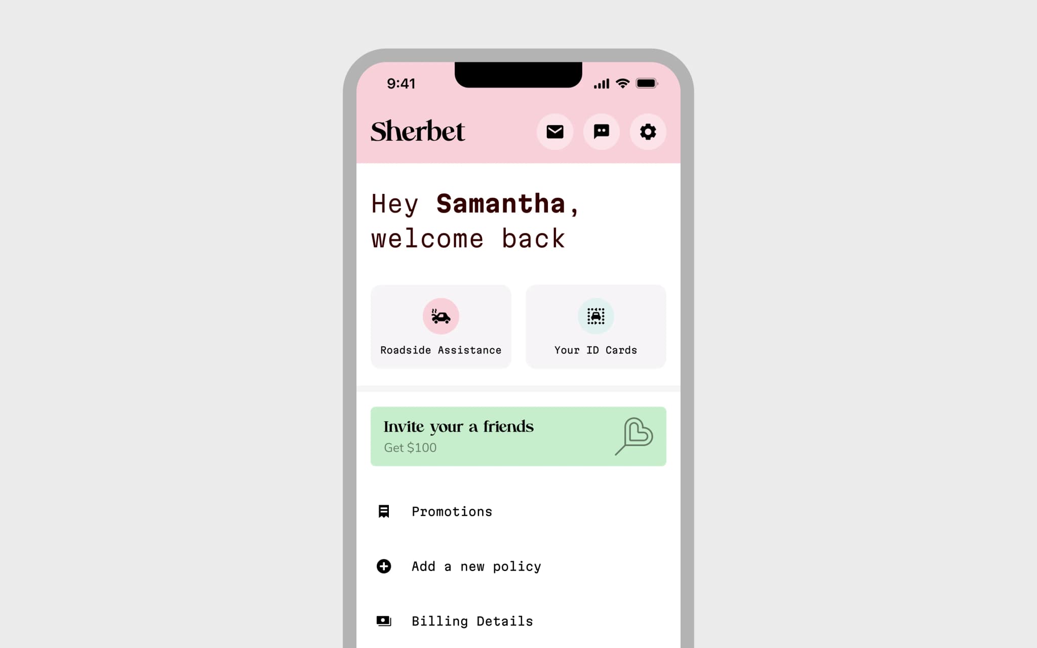
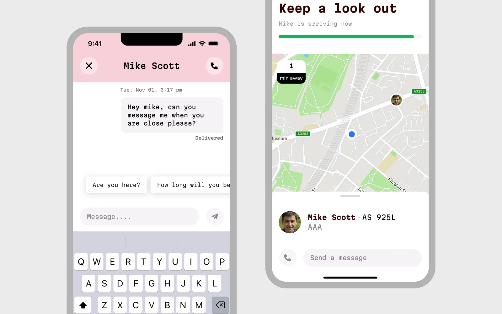
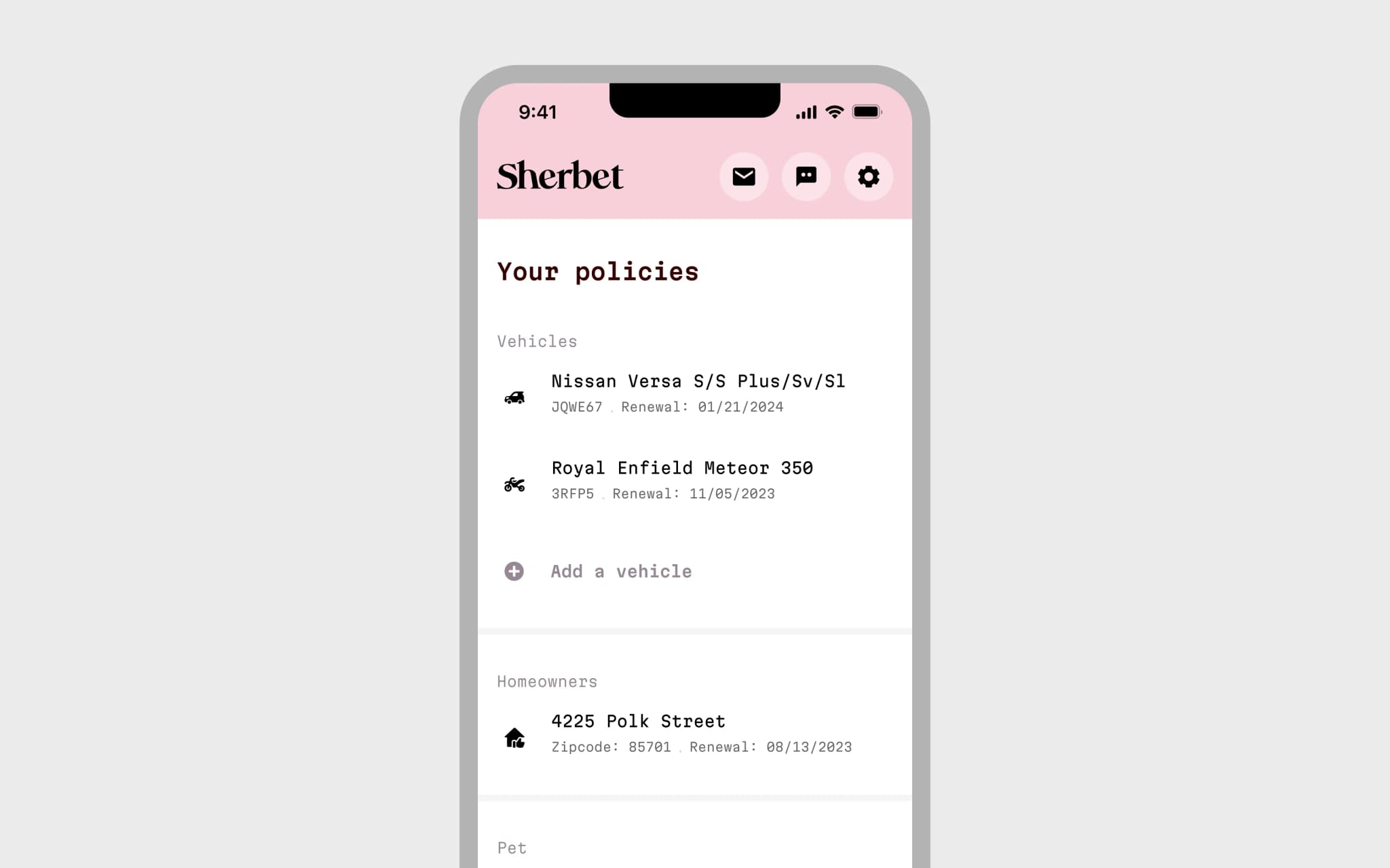
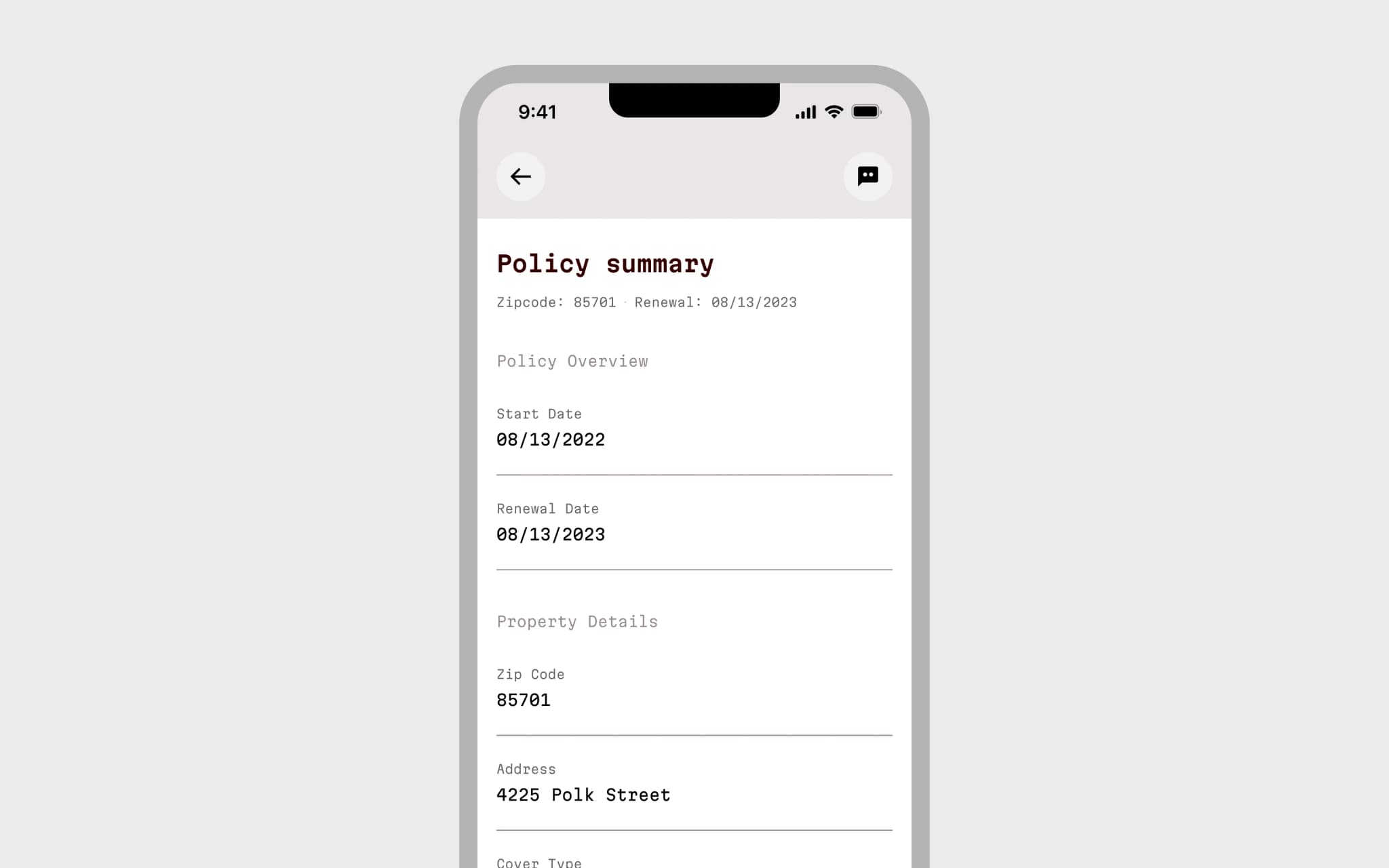
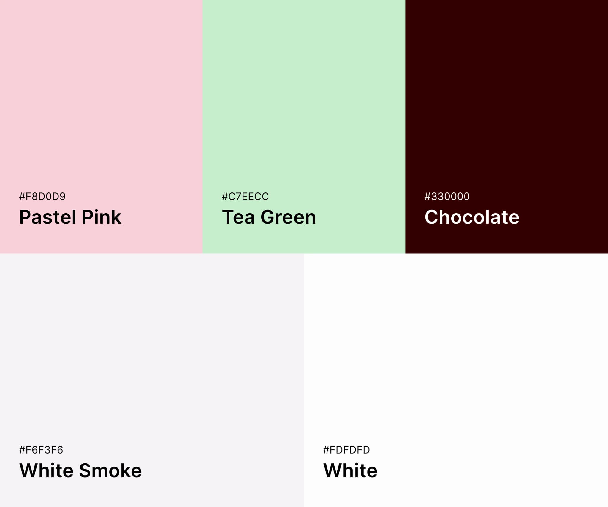
We worked with the client in February 2023 on taking the idea from napkin to an MVP concept, looking specifically at the registration, onboarding and making a claim. Over a 5-Day UX Sprint we mapped out the entire frontend app, and began working on the high-fidelity wireframe from three key workflows: registration, onboarding and making a claim. We were also able to add policy vault and the breakdown flow. After user testing on day 3, we spent a day making the necessary changes before working on the user interface for a final delivery of all the pages plus a prototype at the end of day 5. This included custom icons, colour palette and much more.
Impact
The client was looking for a 'silicon valley' look and feel, with an emphasis on keeping the user interface clean, simple and not out of place with the big global apps.
How we helped
- •User research
- •Market Research
- •Wireframing - Low-fidelity, high-fidelity
- •UX design
- •Design system
- •Prototyping
- •Branding
- •User testing
- •Icon design
App UI Design
Branding
Approach
Pre-flight
Two hour meeting the week before the sprint to meet the team, discuss the project brief, walkthrough the current registration and onboarding process, confirm the deliverables and obtain any necessary assets before the first day of the sprint.
Daily calls
Every morning we had a 15 minute stand up with the client team.
Show & Tell
At the end of each day we sent an email with a link to a prototype plus a video screencast of us presenting our work to the client.
Prototyping
Prototypes not presentations - we prefer to show prototypes instead of screens. This allowed the client to walk through user journeys instead of a set of static screens.
Handover
We performed one round of user testing which were all recorded. The video recordings, feedback and results all made available to the client, and written up into a user testing report.
Project
Team
- •2x Senior UX Designers
- •1x Researcher
Date
Feb 2023
Outcomes & Deliverables
80+ screens
Registration, onboarding, global information architecture
Production-ready
Production-ready screens, assets and iconography
Prototype
Comprehensive prototype split into user journeys
User testing
Video and feedback presented in a report
Design System
Colour, iconography, typography, grids, components
Custom icons
Bespoke iconography
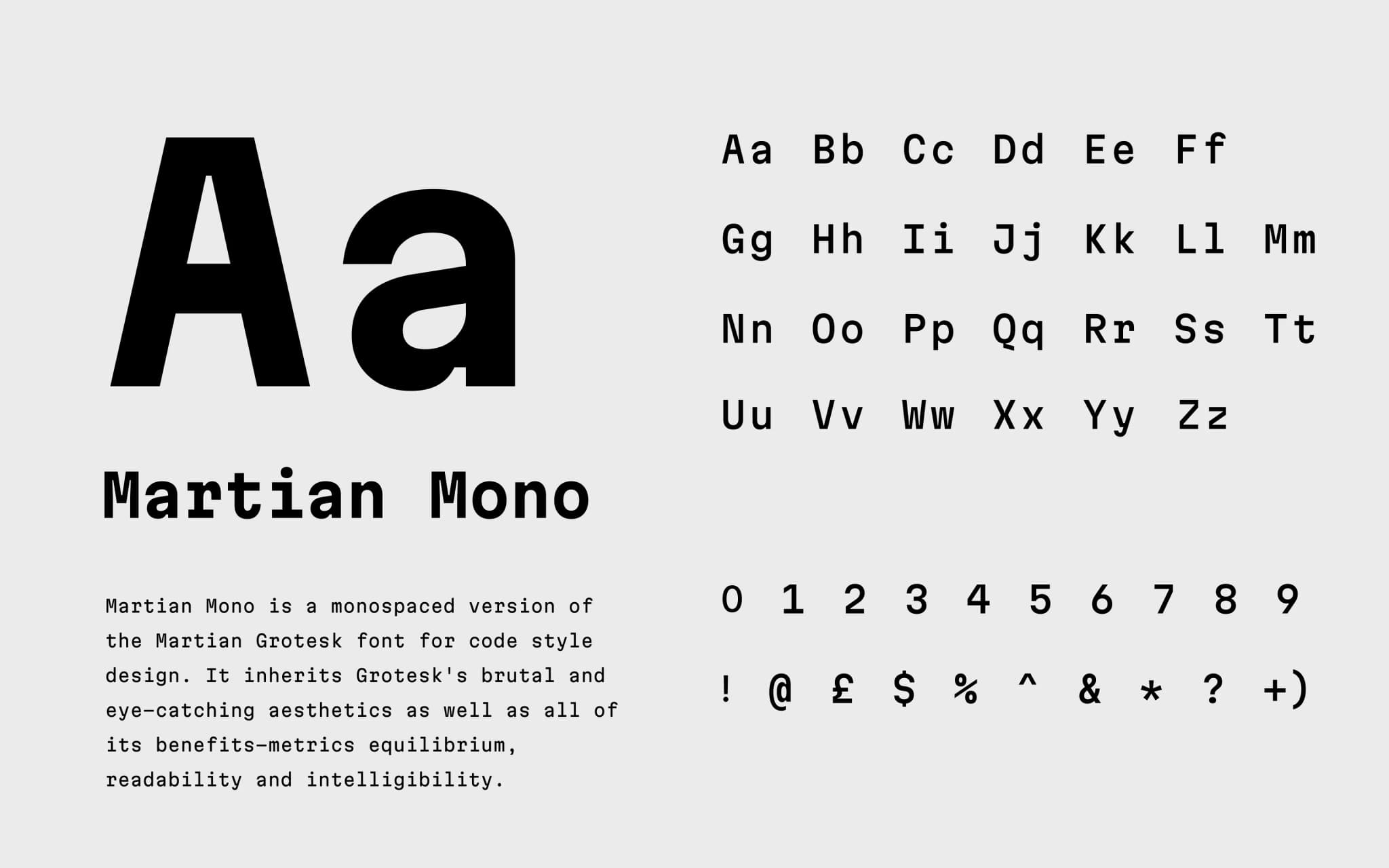
Branding
Complete brand identity development
Video walkthrough
Sharable video of us presenting the final deliverables
5 day delivery
Start to finish in just five days
Next case study
JustLend